Evaluation of my work to Modul 1
`Stars in your eyes `- Shape and Colour -
I started in september 2010 and finished in august 2011. At the beginning, it was not so easy for me, to see, what this doing make sense in my work. But in the course of the modul-work and with the feetback from my tutor, I saw more and more what about the meaning of this work. So I tryed to cross my habits, and searched for ways to work less honest. I choose a colour sheme, I never use in my daily routine. And I mixed the colours with black and white, and became wonderful colours, I never thought. The work with the paper was not my favorite, but the work with the fabric was a nice doing. Chapter 7 and 8 I liked very well. The different ways to arrange the shapes and the surprise to see the results, showed me new ways to develop a new design. Chapter 11 was interisting to do, because it was a complex work with a visible process, and a resolved sample. This was the reason, I began to work in a sketchbook DIN A 3. So I have all my reseachs together.
If I had to do this work again, I`d like to work more free, make more inventive experiments. I think there are 1000 and more ways to do this work, so every new start will bring other results.
And sometimes more photos about the evolution of the work so you can see more about the way of working.
I spend a long time to translate the modul-input, and to write in english to my blog and my tutor. To built the blog at the beginning was a difficult work for me, because I am not close with this kind of computerwork. And I am proud, that I made this alone with a result to be in working order.
The real working time for dying paper and fabric perhaps 20 hours. To make the design of all chapter, circa 110 hours. To make photos and post it on the blog, all together 35 hours. I don`t look for the time I notice interisting website or blogs, to write down the adress of shops you can by material and create a book about my visits at museums ....and something like that.
Wednesday, 24 August 2011
Friday, 19 August 2011
 Picture 4

Picture 3
Paul Klee was born 18.12.1879 in Switzerland. 1898 he began study art in munich in Germany. He made journeys for example to Italy and France. After he came back he met the artists Kandinsky, Marc and Macke. He added the artist group " Blue Rider " and was affected from the Cubism art.He loved music, and many of his image-titles are in connection with the music. He played with form and colour, and he wanted "...to bring light in the darkness of the world...". In the time where Klee`s aesthetic age up, the light always stand in the mittle of his work. Sometimes his images are reserved and other time they are very colourful, often he used one basic colour and painted in different tone. He used geographical sign like star, crosse, triangle, rectangle, quadrat, line, circle and often the arrow.
 Picture 2
Wassily Kandinsky was born 16.12.1866 in Russian. He was a painter, graphic artist and a art historian. Some times he lived in Germany and France. He was an artist of the expressionism and the abstract art. He died 13.12. 1944 in France.
 Picture 1
This is a picture from my book about Herta Puls. The picture was titled " Modern geometric design mola ". It was a part from a chapter about the Kuna Indians. The woman wearing the traditional fabrics with mola design. Sometimes as a blouse or a wrap-aroung skirt.
Chapter 12
THREE ARTISTS


 Picture 15
Resolved stitched sample
Different materials bonded on deyed S 80, machine and hand stiching
 Picture 14
Resolved design
In each corner are different ways to show the shape, and they desintegrate more and more at the way to the center.
 Picture 13
Different ways of composing the shapes
 Picture 12
above: optical illusion of desintegration
below: different ways to compose desintegating shapes
after I glued the left little shapes you cant`t see the different ways of desintegration ( piercing ), so i used a black pen to show it better - I thought it wasn`t a good idea.
 Picture 11
To make shape out of several smaller shapes
 Picture 10
above: to make a shape thinner
below: to make a shape become lss solid
 Picture 9
Third toughts
Different ways of desintegrating a square of fabric.
It was a nice work wtih the " loosely " fabric.
 Picture 8
Picture 6-8 shows a method to cut a shape and make them more desitegate each time.
 Picture 7
 Picture 6
 Picture 5
then desintegrate with a heat tool
 Picture 4
The right lutradur was bonded on kunin felt, then both machine stitched
 Picture 3
Lutradur, dyed with transfer colour
 Picture 2
Desintegate papers and equal distribution from papers I bought in a shop.
 Picture 1
Different ways to desintegrate paper
First thoughs
Monday, 25 July 2011


 Picture 5
Sample1
 Picture 4
For the shape i used my linol shape from chapter 2 and made a complete shape from this smal piece.
 Picture 3
Picture 2 and 3 show the way I prepared my felt, before I cut
 Picture 2
 Picture 1
From the top to the bottem:
Laced insertion stitch, simple insertion stitch, plaited insertion stitch, bottenhole insertion stitch,
beaded insertion stitch, bottenhole bar, machine stitching
It was interisting to do this work. I used different felt pieces, at some time i bonded coloured "Bonda-web, or made handstitcheing before I cut them in pieces.
I had a lot of fun with the differnt insertion stitches, and was surprised about the effect that I had have with the last piece- positive and negative shapes swapped.


 Picture5
 Picture 4
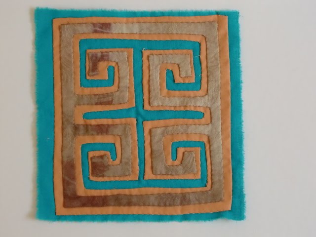 Picture 3
 Picture 2
 Picture 1
Chapter 9
REVERSE APPLIQUE-TRADITIONAL AND CONTEMPORARY METHODS
Few month ago, i bought a book about Herta Puls. And now I take a look in it and read about mola technique. Then I choose the frontpicture for my first work.
The first test was not successful, because I cut away on the wrong side. The second was a good result. At the contemporary method i like the multi-coloured-ripple-effekt best. It was so nice when I cut away the first layer, to see which colour comes out. Surpise.
Thursday, 23 June 2011

Picture 6
The first shape was applique with a interisting machine-stitching, but you can`t see it at this point.
The second layer was only painted Bondaweb, but it had`t enough contrast, so i drawed a golden line at the edge and filled out with cretan stitch. The same shape rotated 45° was the third layer. After the first layer, I padded the centre, but it was not the right time. You can`t see it at the finishd piece.

Picture 5
At the backround fabric I ironed painted Bondaweb, added the first layer with many seeding stitches. The third layer is the repeat of the first , but rotated 45°. Two pieces added for a spezial centre looking.

Picture 4
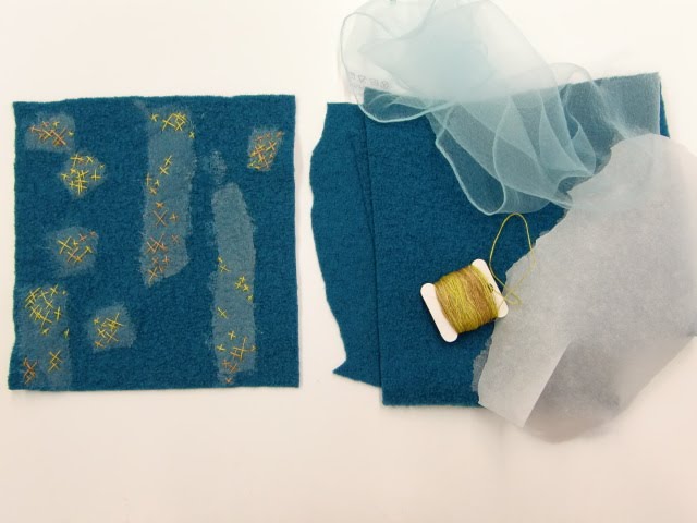
Here I used felt for the backround. The first shape is a light polyesterfabric. Here I done some needle lace. Further I added some cut-out shapes with cross stitch. The second shape is made with a silkyarn called " sari yarn " from India. I couched it with a thin thraed. The centre is accented with golden cross stitch.

Working sheet

Picture 3
Now here I displaced the shapes, I added some pieces from the cut-outs, and the centre was padded.

Picture 2
The backround is my favorite silkfabric, dyed with onion and leaves. Appliqued a red polycotten fabric with machine stitching, turquoise cotten with gold machine stitching. Added two cut-out pieces. After that i used a orange thread and stitched the second shape again, but I turned through 90°. Hand stitching was done over it, that it is better to see.

Picture 1
Two self-dyed cottonfabrics in my colour scheme, one silkfabric, golden machine-stitching and hand stitching
 Working sheet
 Searching for scapes and broken scissor, because the felt and the fabric were to thick
Complex Samples
I had a lot of fun to do this work, but at the beginning I need a lot of time to found the right shapes for this work. The shapes I thought they were interisting , there were to complicate, and the other one looks like to boring. So I cut many papers, and look again and again in my sketchbook. At the end I used a pair of two different shapes and create in each case three pieces.
I uesed many different fabrics, hand-and machine-stitching threads. At two times I iron painted bondaweb, to become an interisting surface. It was nice to combinate machine-and handstitching together, because there can come more tension in the image.
Saturday, 28 May 2011

Picture 5

Picture 4

Picture 3
back side to picture 2

Picture 2
front side

Picture 1
I ironed the pieces- there was bonda-web on the back side - into the journal, and then i painted with a smal black pen, with golden colour, made stitching and so on.
Subscribe to:
Comments (Atom)